Project Overview
The TYŠA (tysha.eu) project, initiated by Oleksand Yakovyshyn, presented us with an opportunity: to create an online magazine dedicated to the often unseen, forgotten, or repressed narratives of Ukrainian art and culture. Our mission was to build a platform that not only honored this important content but also provided a seamless and engaging experience for both readers and content creators. We’re proud to share how we designed and developed this sophisticated platform from scratch in an intensive two-week sprint.
The Vision
TYŠA’s main goal is to “break the silence about hidden Ukrainian culture.” It’s a place for articles and special projects that dig into Ukrainian art, history, and media that many people don’t know about. It’s for everyone – people who are curious about Ukrainian culture, those who already love it, and artists looking for inspiration.
Objectives
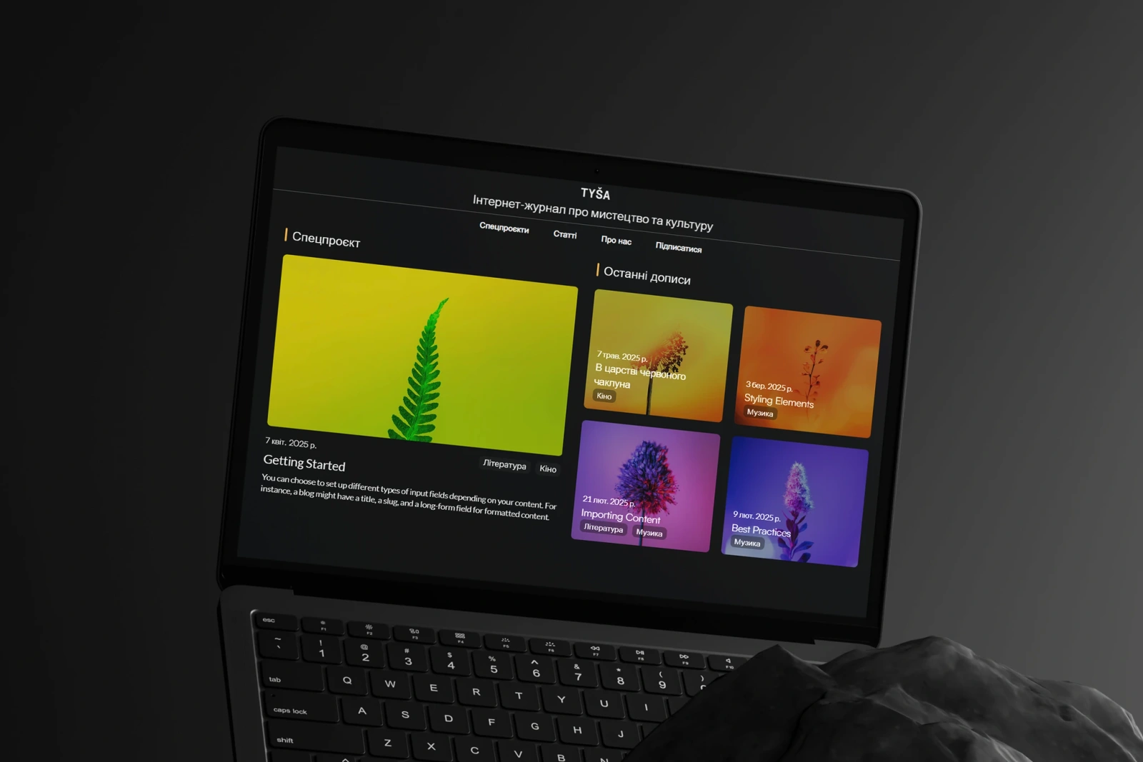
- Create a simple design system with focus on UX and readability. Main request was to avoid design tropes of other magazines and to avoid information overload as much as possible.
- Utilization of Framer for both easy editor experience and a good CMS.
- Compliance with WCAAG, setting on SEO foundations for better search engine visibility.
- Due to Framer lacking its own database for backend operations, we also needed to implement BaaS solution.
Our solution: Agile Development and Custom Technical Innovation
I had around two weeks to develop and host a website and a database for it.
Week 1: Foundation, Vision & Design Solutions
- Day 1: Inspiration gathering
- Days 2-3: Prototyping in Figma, mapping out the core user experience and visual identity
- Days 4-6: Development of a working prototype within Framer, bringing the Figma designs to interactive life
- Day 7: Client presentation, collaborative ideation refinement, and finalization of color schemes and typography, adhering to client requirements.
- Font Selection: We addressed the Cyrillic font challenge by selecting a combination of Lato and Noto Sans. These fonts offer excellent support for the Ukrainian alphabet and provide the clean, modern readability we sought.
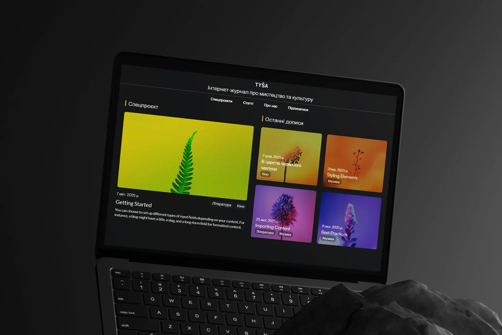
- Design Philosophy: To ensure content remained central, I found inspiration in the clarity and scannability of technical documentation layouts, which heavily influenced this design for the table of contents and overall page structure, promoting ease of navigation and information absorption.
Week 2: Feature Implementation, Custom Integration & Polish
- Days 8-9: Focused development and refinement of interactive components and full establishment of the Framer CMS.
- Days 10-12: Crafting Custom React Components for QoL Features: This phase involved ideation and development of bespoke React code components. Key among these were the ViewCounter and LikeButton components, designed to integrate seamlessly with Framer and communicate with a Supabase backend.
- Day 13 (approx.): Deep Dive into Custom Supabase Integration: Recognizing Framer’s frontend strengths, we engineered a custom solution for backend functionalities using Supabase Edge Functions, bridged by our React components.
- like icon colors and typography for these backend-connected elements, all without needing to write or modify code.
- Day 14 (approx.): Rigorous debugging, cross-browser testing, and collaborative content type trials with the client to ensure platform stability and content readiness.
Look and feel
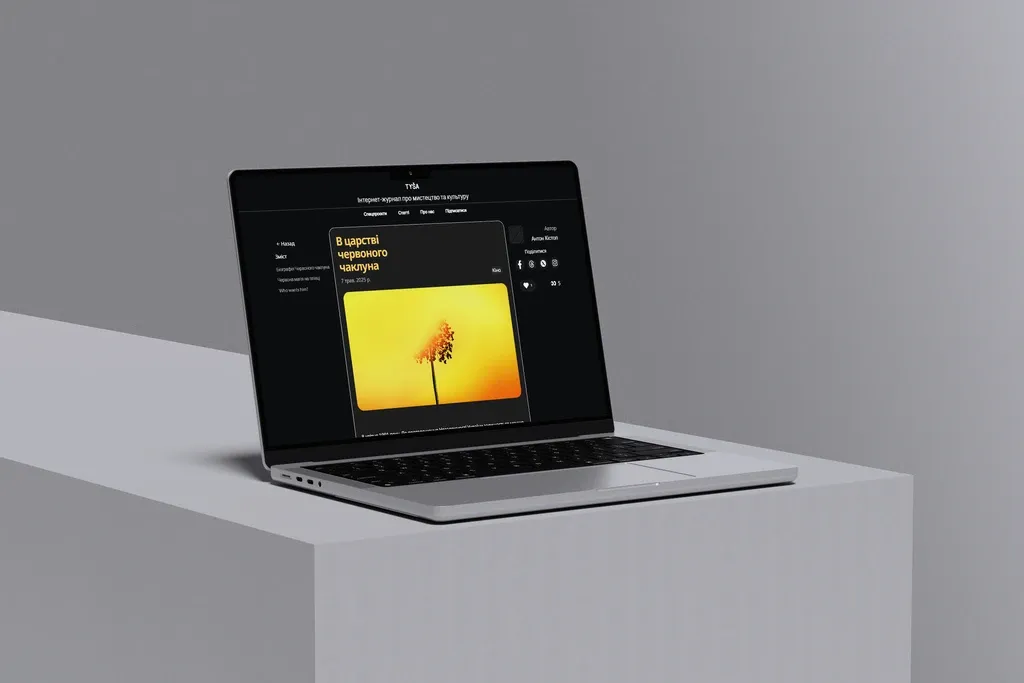
For TYŠA, we wanted a visual style that felt modern, clean, and above all, made the content easy and enjoyable to read. Every choice, from fonts to colors, was made to support the articles and create a welcoming atmosphere for exploring Ukrainian culture. The design also needed to be flexible enough to adapt to both light and dark system themes automatically.
Typography
The right fonts are crucial for readability, especially for a content-heavy site like an online magazine. We also needed excellent Cyrillic support for the Ukrainian alphabet.
- Headings (H1-H6): Noto Sans
- We chose Noto Sans for all headings because it’s a very clear, highly legible sans-serif font. It has a modern feel that isn’t distracting, allowing the titles to be impactful without being overwhelming.
- Crucially, Noto Sans offers comprehensive Cyrillic coverage, ensuring all Ukrainian characters display correctly and crisply. This was a non-negotiable requirement.
- Its range of weights also gives us flexibility in creating a clear visual hierarchy for different levels of headings.
- Paragraph Text (P): Lato
- For the main body text, where extended reading happens, we selected Lato. Lato is known for its warmth and clarity, making long passages of text comfortable to read.
- It pairs well with Noto Sans, creating a harmonious typographic system where headings stand out yet feel related to the body copy.
- Lato also provides excellent Cyrillic support, ensuring a consistent and correct reading experience throughout the articles.
The combination of Noto Sans for headings and Lato for paragraphs gives TYŠA a typographic identity that is both contemporary and highly functional, ensuring the focus remains firmly on the cultural narratives being shared.
Color Palette:
The color scheme was designed to be adaptable, providing a distinct experience for both dark and light system themes, while maintaining excellent contrast and a pleasant aesthetic.
- Dark Theme:
- Background (BG): #121517 (a very dark, near-black)
- Accent Color: #E8B45F (a warm, golden yellow)
- This accent provides a touch of warmth and visual interest against the dark background. It’s used for interactive elements, highlights, and subtle branding touches, drawing attention without being jarring.
- Text Color: #EEEEEE (a light, off-white)
- Light theme:
- Background (BG): #F7F7F7 (a soft, off-white)
- Accent Color: #4E7594 (a calm, muted blue)
- This blue provides a calm accent for the light theme, used for similar purposes as the gold in the dark theme – for interactive elements and highlights.
- Text Color: #2C3E50 (a dark, desaturated blue/grey)
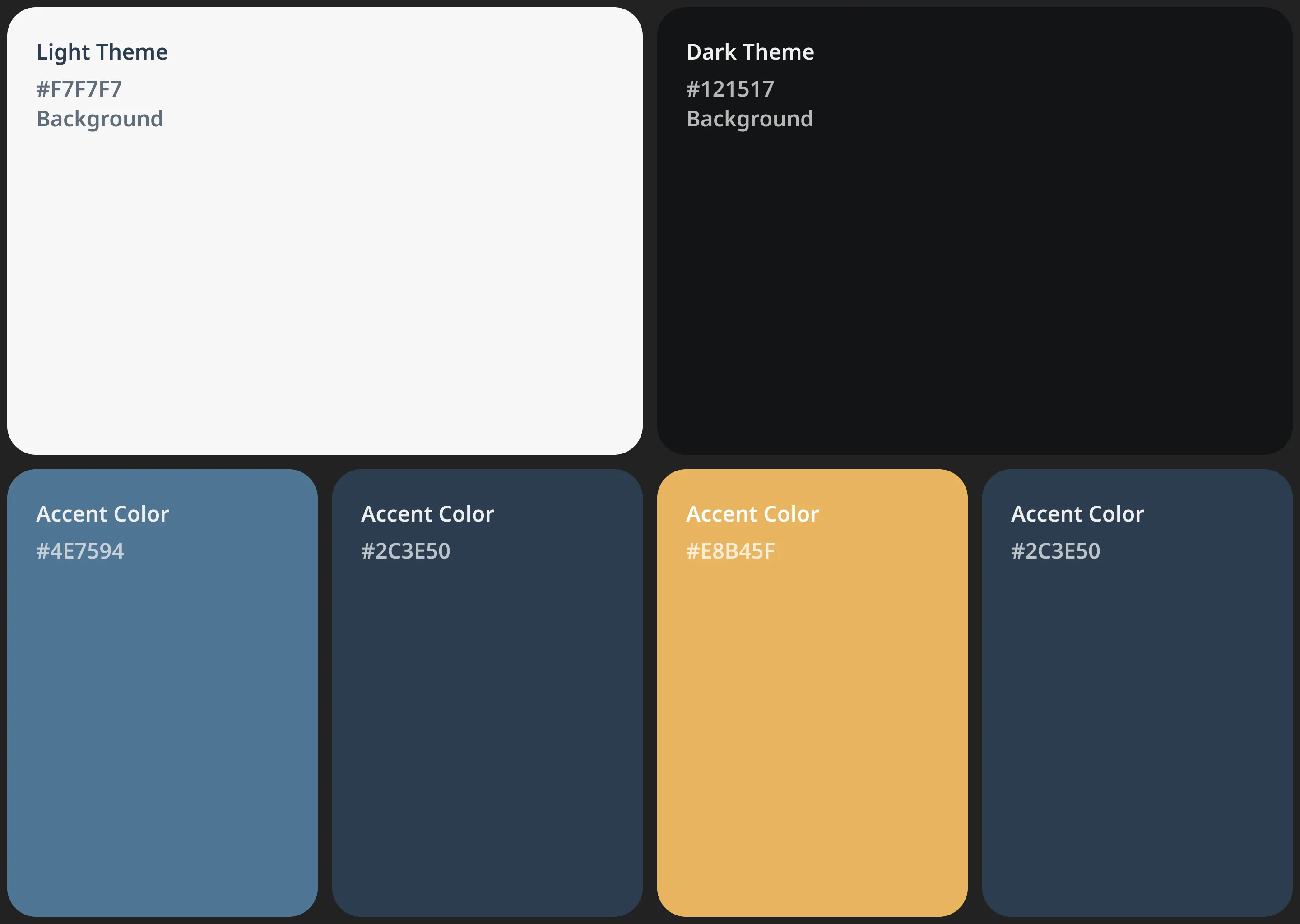
Rationale for Color Choices:
- Readability: The primary goal was to ensure high contrast between text and background in both themes, which is essential for comfortable reading.
- Mood and Atmosphere: The dark theme aims for a more focused feel, while the light theme is bright and open. Different accent colors contribute to these different moods.
- Adaptability: The chosen palettes are designed to complement a wide range of cultural content, from historical articles to contemporary art, without clashing with images or other media.
- Minimalism: The palettes are relatively simple, reinforcing the overall minimalist design and ensuring the colors support the content rather than competing with it.
Code snippets and explanations
- The ViewCounter Component: This component is responsible for tracking and displaying the number of views for an article.
Core Logic - Fetching and Incrementing Views: The useEffect hook manages the API call to a Supabase Edge Function. It determines whether to simply fetch the current count or to increment it first, based on whether the user has viewed the page in the current session (tracked via localStorage).
// Simplified snippet from ViewCounter.js
useEffect(() => {
    // Prevent API calls in Framer canvas or if config is missing
    if (RenderTarget.current() === RenderTarget.canvas || !pageId || !edgeFunctionUrl) {
        // Set mock data for canvas or handle error
        setViewCount(RenderTarget.current() === RenderTarget.canvas ? 123 : 0);
        setIsLoading(false);
        return;
    }

    const storageKey = `<span class="math-inline">\{VIEWED\_PAGE\_KEY\_PREFIX\}</span>{pageId}`;
    const hasViewedInSession = localStorage.getItem(storageKey) === "true";
    const action = hasViewedInSession ? "getCount" : "incrementAndGet";

    const fetchViewCount = async () => {
        setIsLoading(true);
        try {
            const response = await fetch(edgeFunctionUrl, {
                method: "POST",
                headers: {
                    "Content-Type": "application/json",
                    "apikey": supabaseAnonKey, // Supabase public API key
                },
                body: JSON.stringify({ pageId, action }),
            });
            if (!response.ok) throw new Error("Network response was not ok");
            const data = await response.json();
            setViewCount(data.viewCount ?? 0);
            if (action === "incrementAndGet" && !hasViewedInSession) {
                localStorage.setItem(storageKey, "true");
            }
        } catch (err) {
            setError("Failed to load views");
            setViewCount(0);
        } finally {
            setIsLoading(false);
        }
    };
    fetchViewCount();
}, [pageId, edgeFunctionUrl, supabaseUrl, supabaseAnonKey]);
Explanation:
- It checks RenderTarget.current() to provide mock data when viewed within the Framer editor canvas.
- For the initial launch, localStorage (VIEWED_PAGE_KEY_PREFIX) is used to track if a page has been viewed in the current browser session. This was a pragmatic choice for rapid deployment, with plans for a more robust user authentication system to provide precise, user-specific tracking in the future.
- The Workspace call communicates with the specified edgeFunctionUrl, sending the pageId and the desired action (“getCount” or “incrementAndGet”).
Framer Controls: We used Framer’s addPropertyControls API to allow the site owner to easily configure each ViewCounter instance directly within the Framer interface.
// Simplified snippet from ViewCounter.js - Property Controls
addPropertyControls(ViewCounter, {
    pageId: { type: ControlType.String, title: "Page ID", defaultValue: "unique-page-slug" },
    edgeFunctionUrl: { type: ControlType.String, title: "View Count Function URL" },
    supabaseAnonKey: { type: ControlType.String, title: "Supabase Anon Key" },
    iconOuterColor: { type: ControlType.Color, title: "Icon Outer Color", defaultValue: "#DDE8E3" },
    // ... other visual and functional props
});Explanation: This makes the component highly reusable and configurable by non-developers, aligning with our goal of client empowerment.
- The LikeButton Component: This component enables users to like articles and see the current like count. It features optimistic updates for a responsive user experience.
- Core Logic - Initial Status and Toggling Likes: On mount, useEffect fetches the initial like count and whether the current user (session/browser-based in this phase) has already liked the item. The handleLikeToggle function manages the like/unlike action.
// Simplified snippet from LikeButton.js - handleLikeToggle
const handleLikeToggle = async () => {
    if (isLoading || likeCount === null || !buttonId || !edgeFunctionUrl) return;

    setIsLoading(true);
    const optimisticLiked = !isLiked;
    const currentCount = likeCount ?? 0;
    const optimisticCount = optimisticLiked ? currentCount + 1 : Math.max(0, currentCount - 1);

    // Optimistic UI update
    setIsLiked(optimisticLiked);
    setLikeCount(optimisticCount);

    try {
        const response = await fetch(edgeFunctionUrl, {
            method: "POST",
            headers: { /* ... headers ... */ "apikey": supabaseAnonKey },
            body: JSON.stringify({
                action: optimisticLiked ? "like" : "unlike",
                buttonId: buttonId,
            }),
        });
        if (!response.ok) throw new Error("Network response was not ok");
        const data = await response.json();
        // Sync with actual server state
        setLikeCount(data.count ?? 0);
        setIsLiked(data.isLikedByCurrentUser ?? false);
    } catch (err) {
        // Revert optimistic update on error
        setIsLiked(!optimisticLiked);
        setLikeCount(currentCount);
        setError("Action failed");
    } finally {
        setIsLoading(false);
    }
};
Explanation:
- Optimistic Update: The UI immediately reflects the user’s action (like or unlike). setIsLiked and setLikeCount are called before the API request completes.
- The Workspace call then communicates this action to the Supabase Edge Function.
- If the API call succeeds, the local state is confirmed or updated with the authoritative data from the server.
- If the API call fails, the UI reverts to its previous state, ensuring data consistency.
Framer Controls: Similar to the ViewCounter, the LikeButton offers extensive customization through Framer’s property controls.
// Simplified snippet from LikeButton.js - Property Controls
addPropertyControls(LikeButton, {
    buttonId: { type: ControlType.String, title: "Button ID", defaultValue: "unique-button-id" },
    edgeFunctionUrl: { type: ControlType.String, title: "Like Function URL" },
    likedColor: { type: ControlType.Color, title: "Liked Icon Color", defaultValue: "#FF0000" },
    // ... other visual and functional props
});
Key Features Delivered (Pre-Launch):
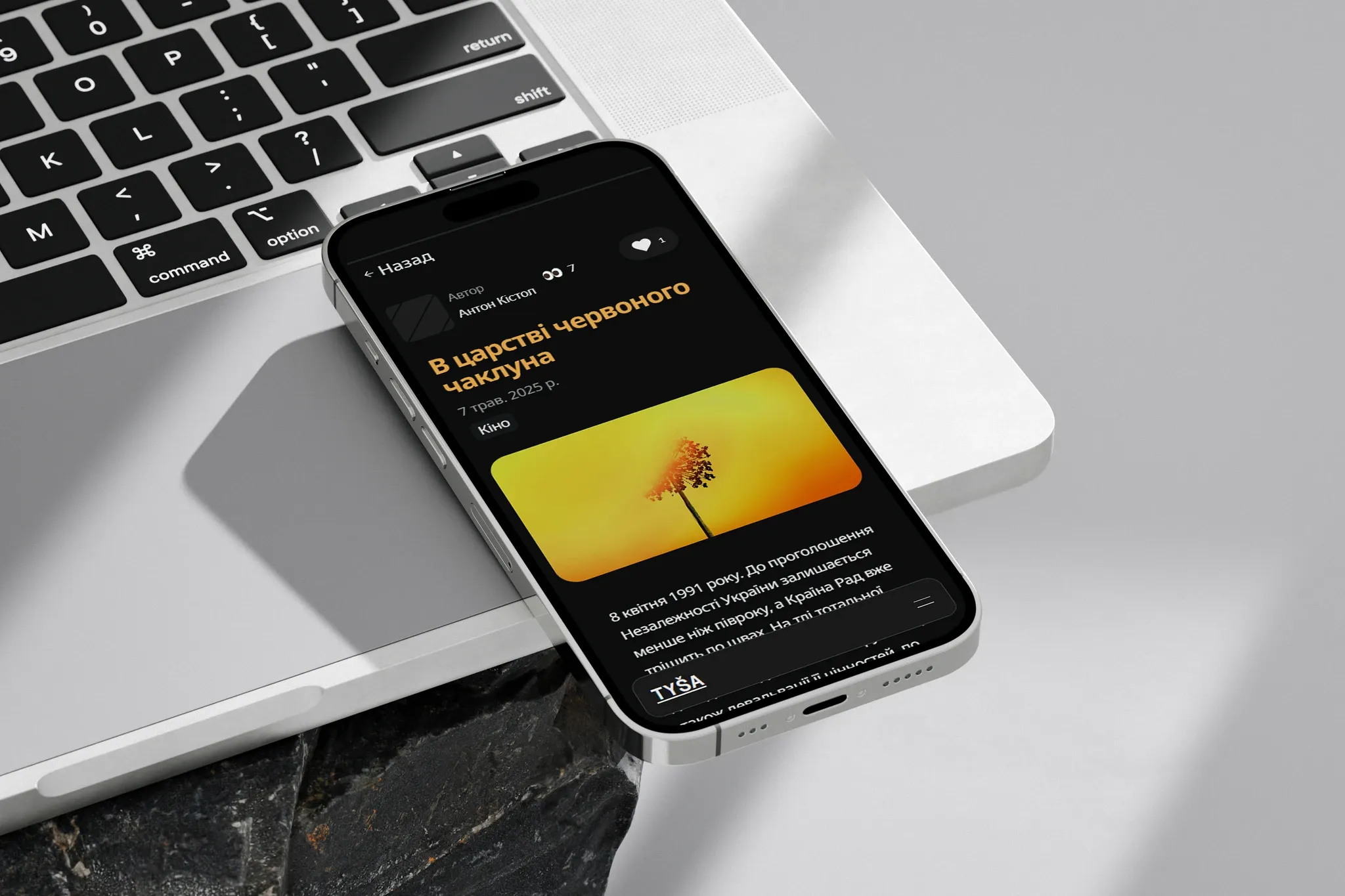
- Modern, Adaptive Design: A sleek, minimalist UI that automatically adapts to the user’s system light/dark theme.
- User-Friendly CMS: Intuitive content management via Framer.
- Custom Dynamic Engagement Features:
- View Counters: Powered by our custom React component and Supabase Edge Functions.
- Like Counters & Buttons: User-specific liking functionality with optimistic updates, also leveraging our custom React/Supabase solution.
- Reading progress bar.
- “Resume reading” functionality using localStorage.
- Streamlined social sharing.
- Optimized “App-Like” User Experience: Thoughtful navigation and component design ensure elements like the main navbar do not reload on page transitions, providing a smoother, faster interaction.
- Enhanced Accessibility & Readability: Achieved through careful font selection (Lato & Noto Sans) and adherence to modern UI/UX best practices.
Future Plans: Expanding the Cultural Dialogue
We’re excited about TYŠA’s potential and have laid the groundwork for future enhancements:
- Immersive Storytelling: Integration of Spline 3D for special projects, offering 3D models and interactive narratives.
- Enhanced User Personalization & Reliable Tracking: Implementation of a full user authentication system (e.g., via Google Authentication). This will provide more accurate like/view counts tied to individual users, overcoming the limitations of the initial localStorage/session-based tracking, and enable features like saving articles.
- Increased Accessibility: Plans to incorporate automatic article voiceovers using ElevenLabs technology.
##Conclusion
The TYŠA project is a prime example of Limina Agency’s commitment to delivering high-impact digital solutions through agile processes and deep technical expertise. In just two weeks, we transformed a visionary concept into a fully functional, aesthetically refined, and technically innovative online magazine. Our custom integration of Supabase with Framer via React not only solved inherent platform limitations cost-effectively but also empowered the client with unparalleled control over dynamic content features. We are confident that TYŠA is now perfectly poised to make a significant contribution to the exploration and celebration of Ukrainian culture, and we are proud to have been its architects.