TL;DR
-
Hybrid sea–air logistics turns the harbour into infrastructure: motherships ferry UAVs to the edge of restricted airspace so drones complete short, compliant hops.
-
Supervisory dashboard stays read-only by regulation and surfaces 30+ telemetry signals without overload; correlated alert taxonomy and lifecycle reduce duplicate noise by ~40%.
-
Unified input model with option for power users to operate dashboard using keyboard only cuts down time to acknowledgement and management by roughly 50%.
-
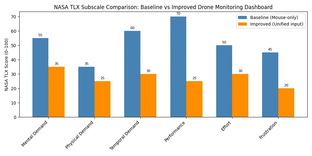
NASA-TLX workload drops ≈53 → 28; ≥85% alerts run Ack → Own → Resolve; zero UI-induced geofence violations; NDA partners in HK/China are lining up trials.
Why This Tech Exists
The densest coastal cities operate on archipelagos and coasts. In Hong Kong (base of HKUST R&D team I’ve been working with) drone deliveries started to appear more and more throughout the city, but its development has quickly grinded to a halt: drones can’t (by regulation and infrastructure constraints) fly over water. Regulation forbids it to avoid creating maritime hazards, and water itself introduces issues like signal multipathing (situation in which signal quality gets degraded due to reflections from water), lack of emergency landing capabilities, need for additional package protection and so on. Traditional UAV programmes fall back to “bigger drone, longer range,” but physics and regulators have closed that door. Guys at HKUST R&D thought to use the water as part of delivery network, and also try to implement unified framework for multi-step, fully autonomous drone interaction systems. Maritime motherships become mobile bases, carrying UAV fleets to islands avoiding over-water flight restrictions altogether. Drones then make tight hops to island pads and return to deck to recharge. This case study is about the monitoring dashboard, UX systems we’ve built and overall business framing of this technology.
Problem Statement
First of all, problems in this project are anticipatory, as I cannot recall any open to use systems for managing such types of drone fleets, so we had to think ahead and anticipate user loads and problems they might face.
Supervisors oversee vessels and UAVs simultaneously, each streaming dozens of parameters—including mission state, battery health, link quality, GNSS fidelity, deck capacity, and live weather overlays. They must spot custody issues, triage alerts, and schedule maintenance. Due to the nature of such systems being autonomous and this being only a supervisory dashboard, there are no flight controls or any way to control the drone apart of reserving it for maintenance. Every surface therefore needs to reinforce “supervise, don’t pilot,” The UI has to:
-
Surface “just-enough” telemetry for anticipatory awareness without overwhelming operators.
-
Make mothership ↔ UAV ↔ island handoffs legible in seconds so accountability never drifts.
-
Maintain equal operability across keyboard and mouse for overall better UX and interaction system. My interviews with maintenance crews showed their high proficiency with linux-based terminal-only systems, so the original idea was to build vim-like keyboard navigation system, but was later scrapped in favor of generalized keyboard navigation
-
Preserve audit trust: every action traceable, no control affordances exposed, and playback capable of retelling any incident end-to-end.
Research, Strategy & Success Criteria
Discovery and system framing
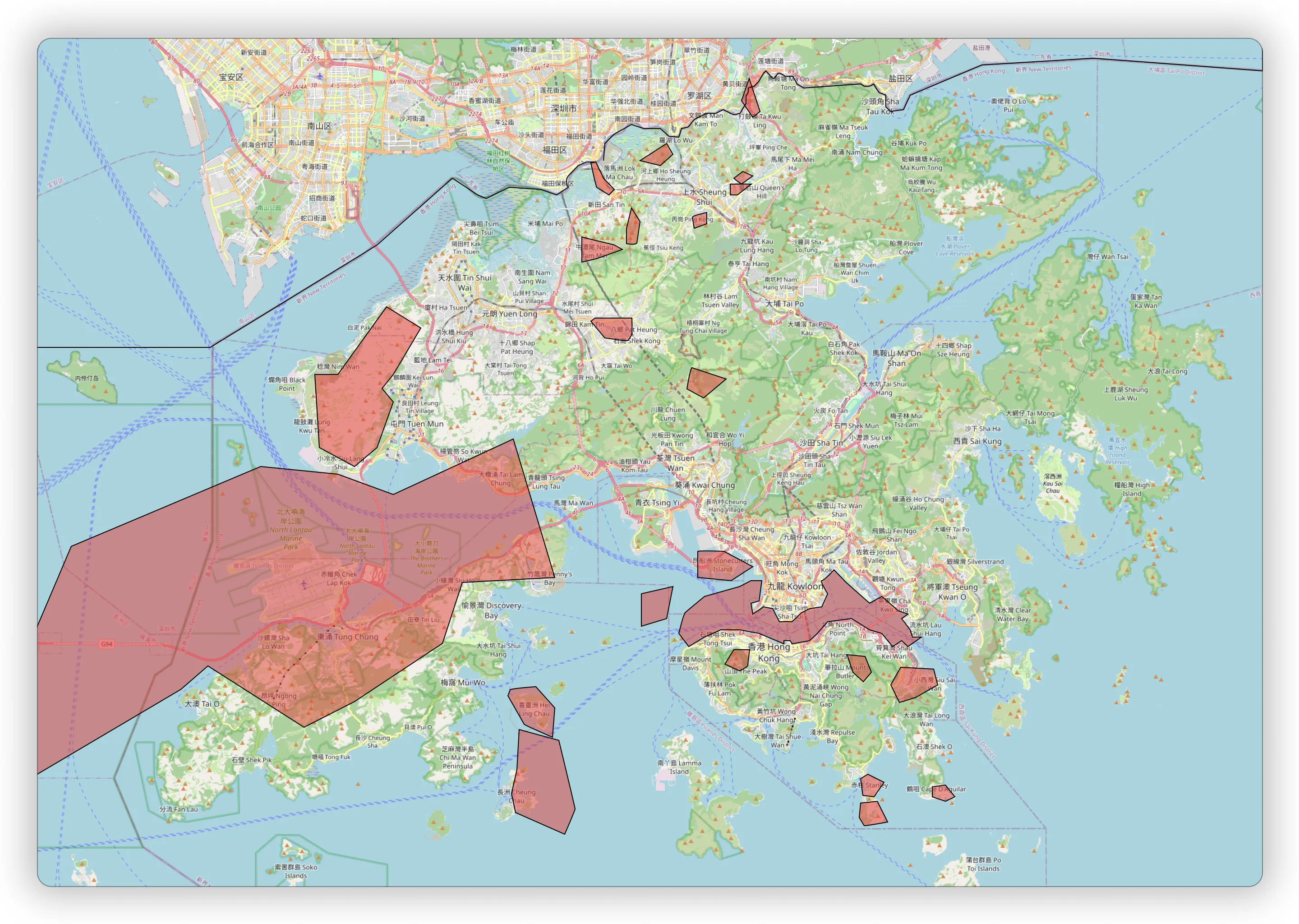
I worked closely together with HKUST’s robotics lab, autonomy engineers, and ops crews to map “minimum viable telemetry” for supervision. Each UAV streams 30+ parameters (mission, power, link, GNSS, environment). Not all deserve equal screen time. Interviews, protocol reviews (MAVLink message sets), and runbooks surfaced which signals actually changed decisions. Concurrently, we audited real HK geofence charts with harbour pilots to catalogue the no-go layers that collapse direct routes.
Team & timeline
-
UX lead (me): information architecture, alert grammar, visual semantics, unified input model, cognitive load studies, architecture mapping.
-
Robotics R&D: firmware + telemetry normalization; heartbeat, position, battery codecs.
-
Front-end engineering: React/TypeScript, Mapbox GL/deck.gl, WebSocket ingest, playback performance.
-
Ops & field crews: noise triage, deck/pad capacity rules, maintenance workflows.
-
Product/partnerships: NDA pilots with HK/Chinese operators; commercial requirements.
Timeline ran six months (Jan–Jun) with four phases: constraints framing, prototype IA, simulated geofence study, demo hardening. July onwards focuses on drone prototype trials and partner onboarding.
Success metrics
We turned qualitative goals into measurable criteria:
-
Time-to-Insight (TTI): ≤3.5 s median from alert to next-step clarity on the map.
-
Time-to-Acknowledge (TTA): ≤3.0 s median on high-severity alerts.
-
Alert lifecycle adherence: ≥85% alerts move Ack → Own → Resolve; duplicates drop ≈40%.
-
Ownership recognition: ≥90% correct in 5-second icon tests.
-
Input parity: ≥95% task completion mouse-only and keyboard-enabled; ~50% faster repeatable tasks with chords.
-
Accessibility & resilience: WCAG AA tokens, zero focus theft during 30-minute streaming soaks.
-
Scale readiness: ≥15 FPS playback at 500 UAVs + 10 motherships; CSV export + playback ready for partner audits.
Three guiding bets anchored the strategy:
-
Map-first supervision—operators reason in geography faster than lists.
-
Alert grammar over volume—families, cooldowns, and lifecycle trump raw counts.
-
Unified input model—keyboard is an accelerator, never a separate UI.
UX & Design
Step 1 — Visual Hierarchy & Cognitive Load
We leaned on preattentive cues. Shape encodes entity class (rhomboid UAV, inverted triangle mothership, rectangle base, hex delivery point); colour carries severity; stroke/halo reinforce urgency for colour-blind operators. Density-aware clustering, zoom-based gating, and instanced glyph rendering keep the map readable at 12–16 px even with 500 entities. Drawer cards mirror the same iconography to avoid relearning when supervisors move from map to detail view. Alert floods cool off via correlation families (Comms, Energy, Ops, Env, Service) and debounced live regions so the first screenful always shows the most actionable signal.
- UAV — Rhomboid (vertical)
- Why it won: The angled geometry reads as “air/rotorcraft” without confusing it with bases or vessels; the vertical axis suggests altitude/flight direction at micro‑scale.
- Alternatives rejected: Circle (too generic, merged with POIs), diamond with dot (busy at 12 px), triangle (competed with vessel semantics).
- Mothership — Inverted triangle
- Why it won: Strong association to a ship’s bow/heading; distinct from UAV rhomboid even at 12 px; easy to spot amidst hex/rect angles.
- Alternatives rejected: Chevron (ambiguous with selection arrows), upright triangle (confused with hazard markers).
- Base — Rectangle
- Why it won: Built‑environment association (“building/pad”); maximizes hitbox without visual noise; stable in clusters.
- Alternatives rejected: Square with roof‑like notch (too fussy at micro‑scale), circle (too generic).
- Delivery point — Hexagon
- Why it won: Distinct side count in the set; reads as a “target/drop” without overlapping with warnings; stays legible when stacked.
- Alternatives rejected: Pin/teardrop (cartographic POI trope; implied interactivity), pentagon (low distinctiveness vs rhomboid/triangle).
![]()
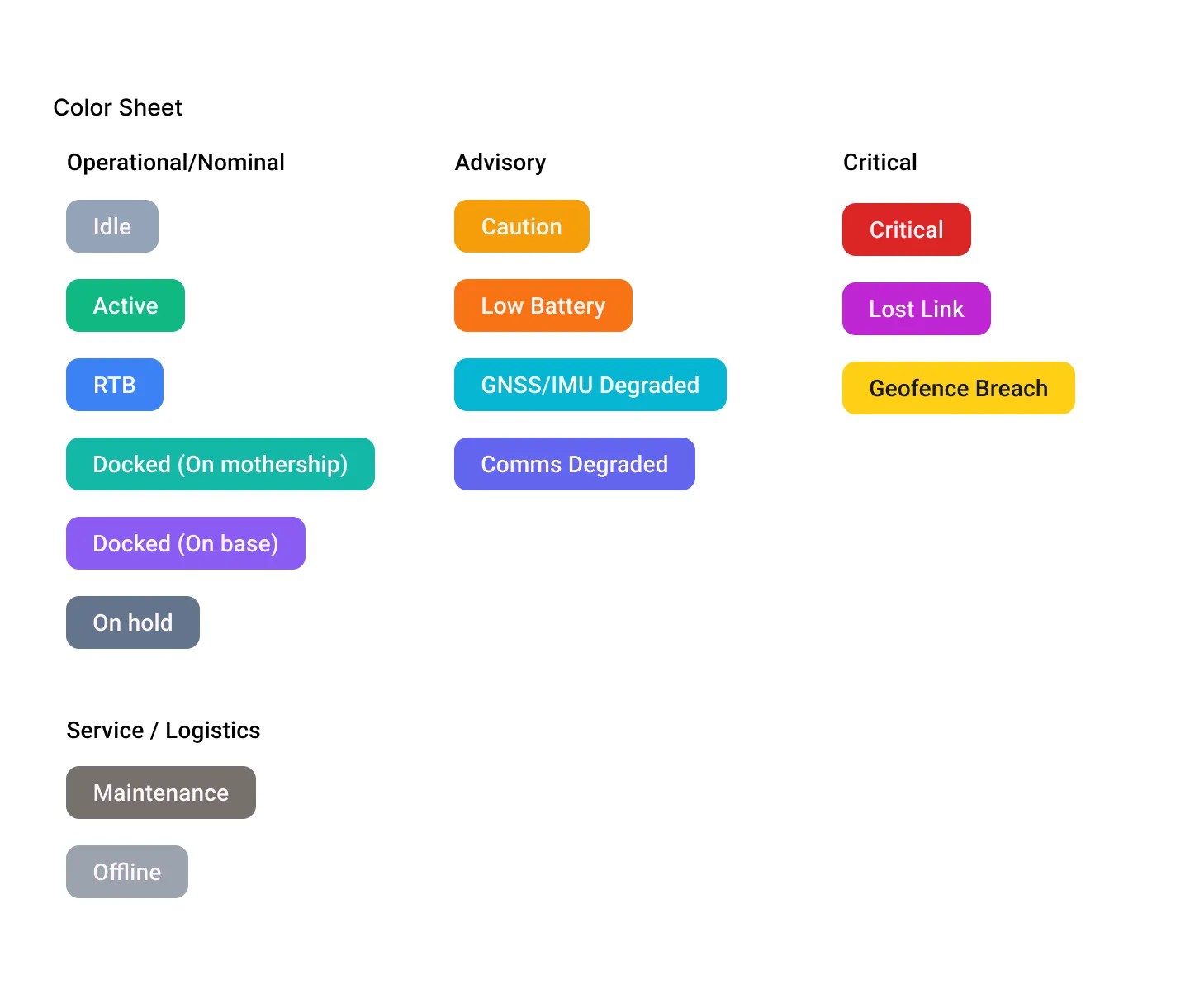
-
Operational/Nominal → low‑contrast, cooler tones. Reasoning: Low‑arousal tones for steady state; green supports “active/healthy” mental model without dominating the map.
-
Advisory → mid‑contrast, saturated warm/cool tones. Reasoning: Noticeable but not alarming; preserves a step‑up from nominal while reserving warm‑red for true danger. Cyan handled GNSS/IMU uniqueness well against sea/land backdrops.
-
Critical → high‑contrast, saturated warm tones (reds/yellows) with caution framing. Reasoning: Preattentive pop for violations and “act‑now” conditions; used sparingly to avoid red‑washing. Yellow reserved explicitly for Geofence Breach to align with caution/ boundary metaphors.
-
Service/Logistics → neutral greys/browns; never mistaken for active alerts. Reasoning: Intentional de‑emphasis (maintenance/offline) so operational attention isn’t hijacked.
Status & Alert Catalogue (by family)
Operational / Nominal (state chips)
-
Idle — craft on, awaiting task.
-
Active — executing mission segment (en‑route/operational).
-
RTB — return‑to‑base mission phase.
-
Docked (on mothership) — on deck/inside, optionally charging.
-
Docked (on base) — at land base, optionally charging.
-
On hold — queued/paused by autonomy according to rules.
Advisory (non‑blocking, requires attention)
-
Caution — generic advisory; context in details.
-
Low Battery — below advisory threshold for phase; ETA recalculation recommended.
-
GNSS/IMU Degraded — fix type/HDOP outside nominal; check environment/path.
-
Comms Degraded — RSSI/latency/packet loss trending worse; may drop to LoRa only.
Critical (blocking/violating, immediate triage)
-
Critical — umbrella for high‑severity non‑geofence conditions (e.g., battery critical, thermal limit).
-
Lost Link — heartbeat loss beyond threshold; autonomy safeties apply.
-
Geofence Breach — predicted/actual boundary violation; incident review required.
Service / Logistics (non‑urgent system states)
-
Maintenance — craft flagged for service; removed from scheduling.
-
Offline — no telemetry expected (powered down/storage/shipping).
Step 2 — The UI & Information Economy
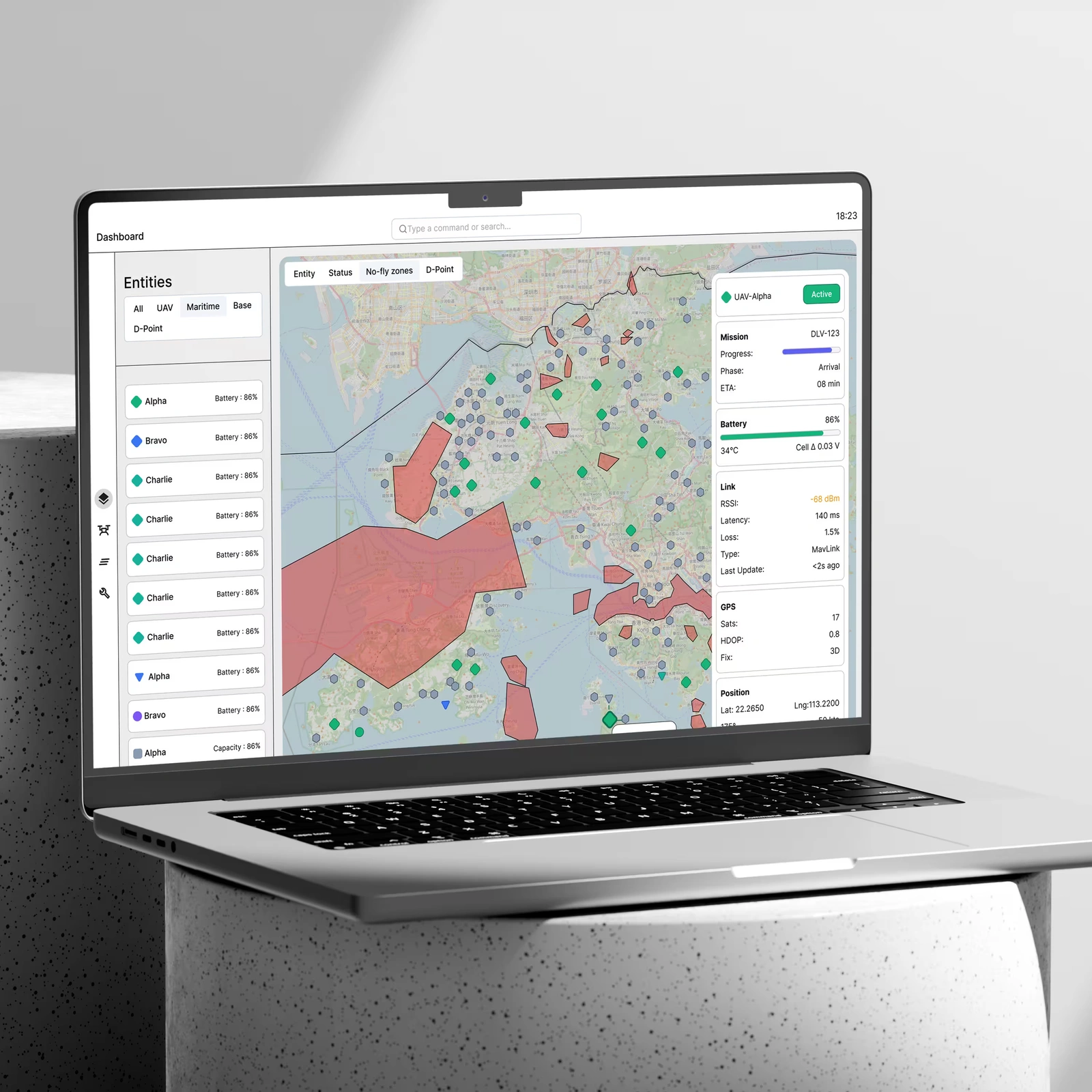
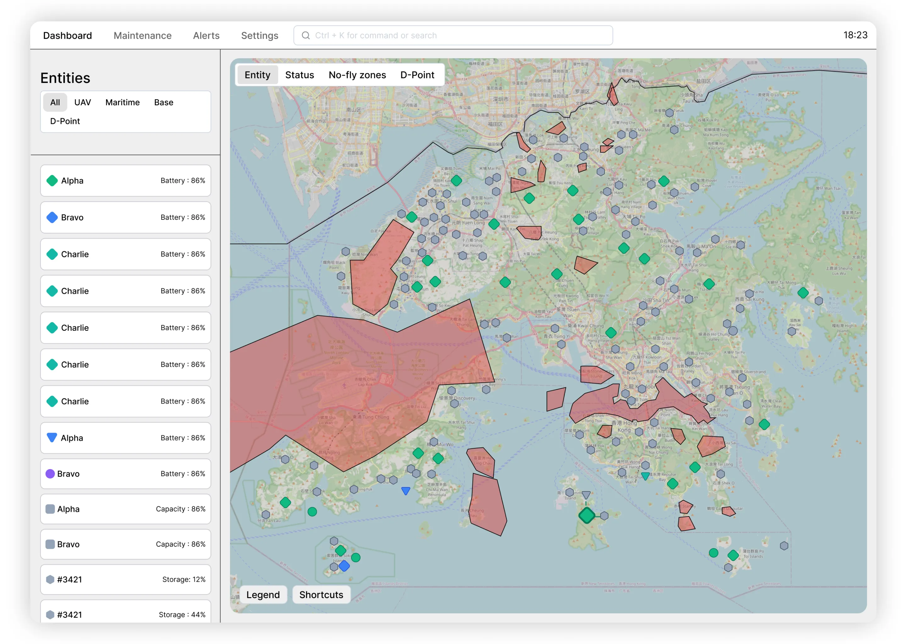
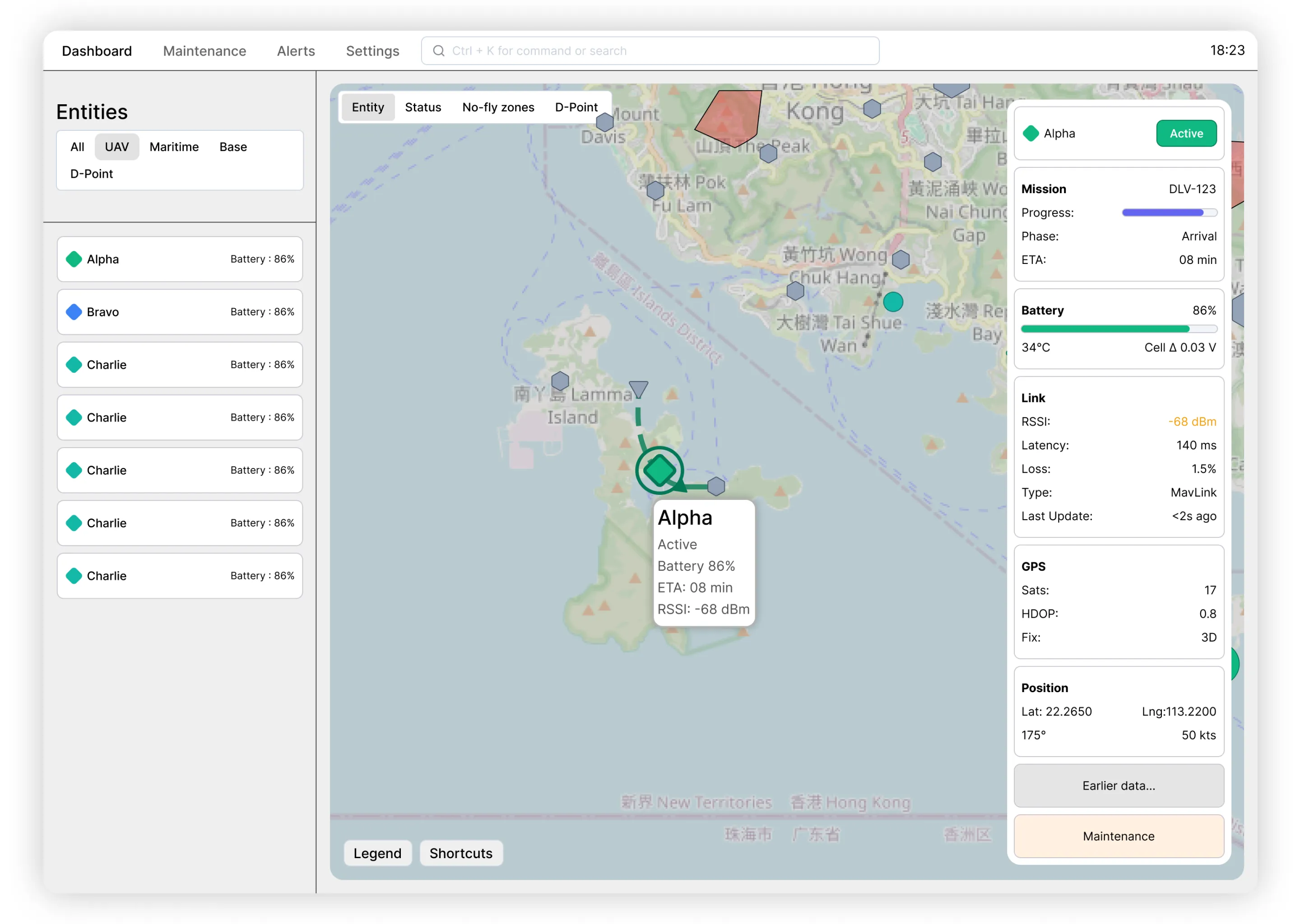
Two surfaces do the heavy lifting. The Overview Map combines an entities rail, Mapbox GL canvas, and right-hand drawer. Alerts highlight, supervisors focus the entity (Ctrl+1 → arrows → Enter), scrub recent history (to be implemented), and hand off to maintenance in one rehearsable path. The conditional drawer (appears only on entity focus) exposes five telemetry groupings by default (Mission progress, Battery, Link, GPS, Position)
It presents users with simple yet multi-layered information system. First, it is the map of the region (in this case it is Hong Kong archipelago), permanent no-fly zones, API-enabled temporary no-fly zones, bases, delivery points drones, motherships. In focus view (upon clicking on any of the entities) the drawer with extended information opens up, showing telemetry and other information (like current mission for bases, carried UAV’s for motherships, empty/full charge pads on bases). Next layer is color-coding. All entities are color coded based on their priority status. Color coding system is explained below.
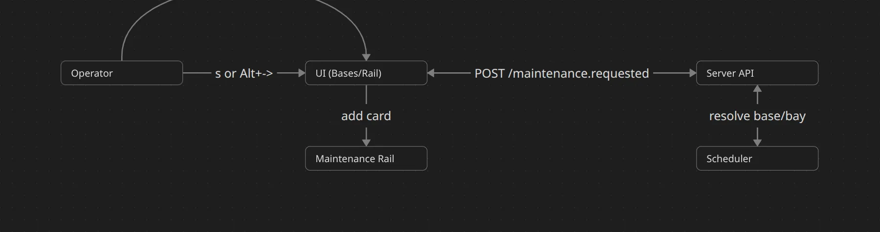
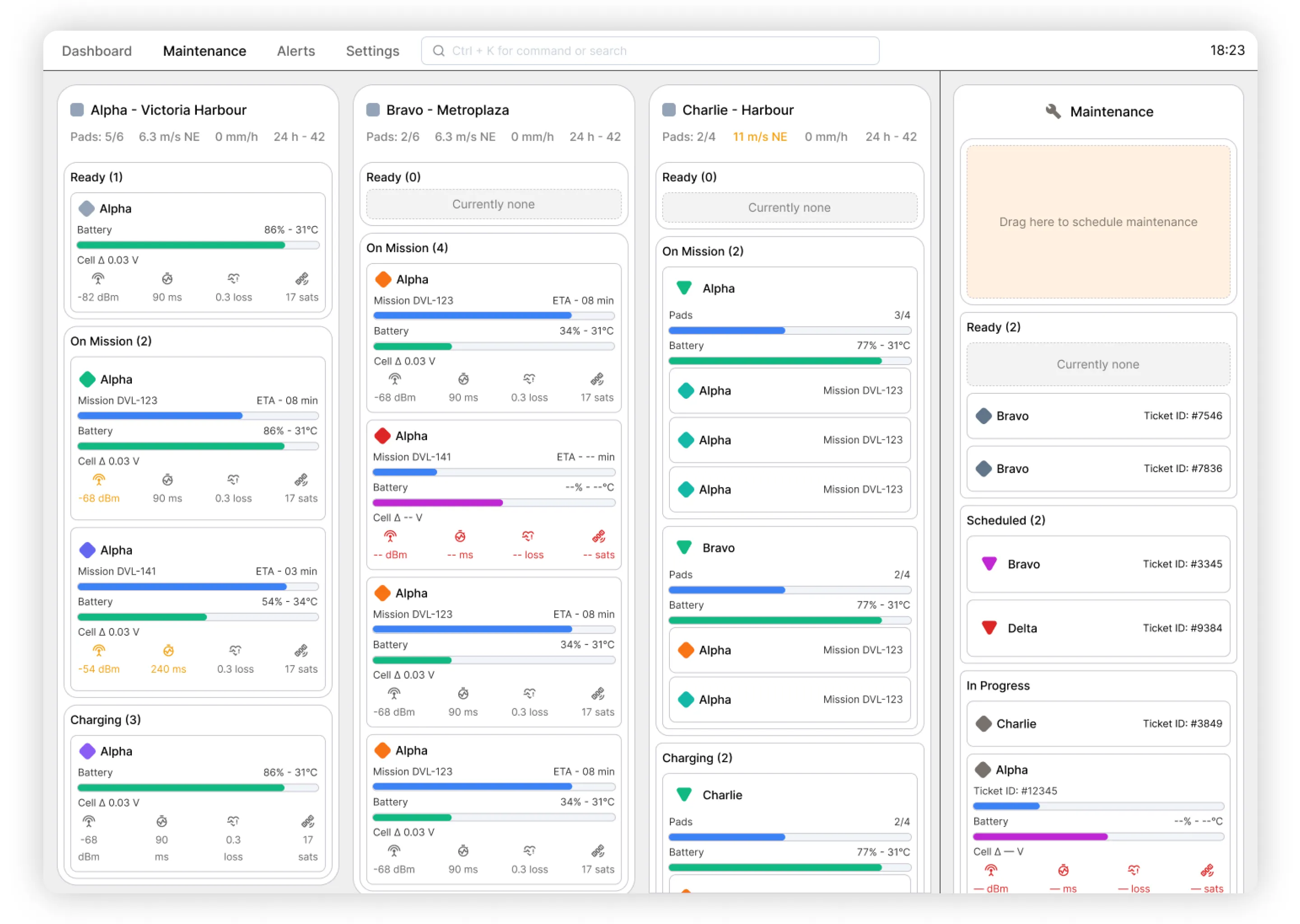
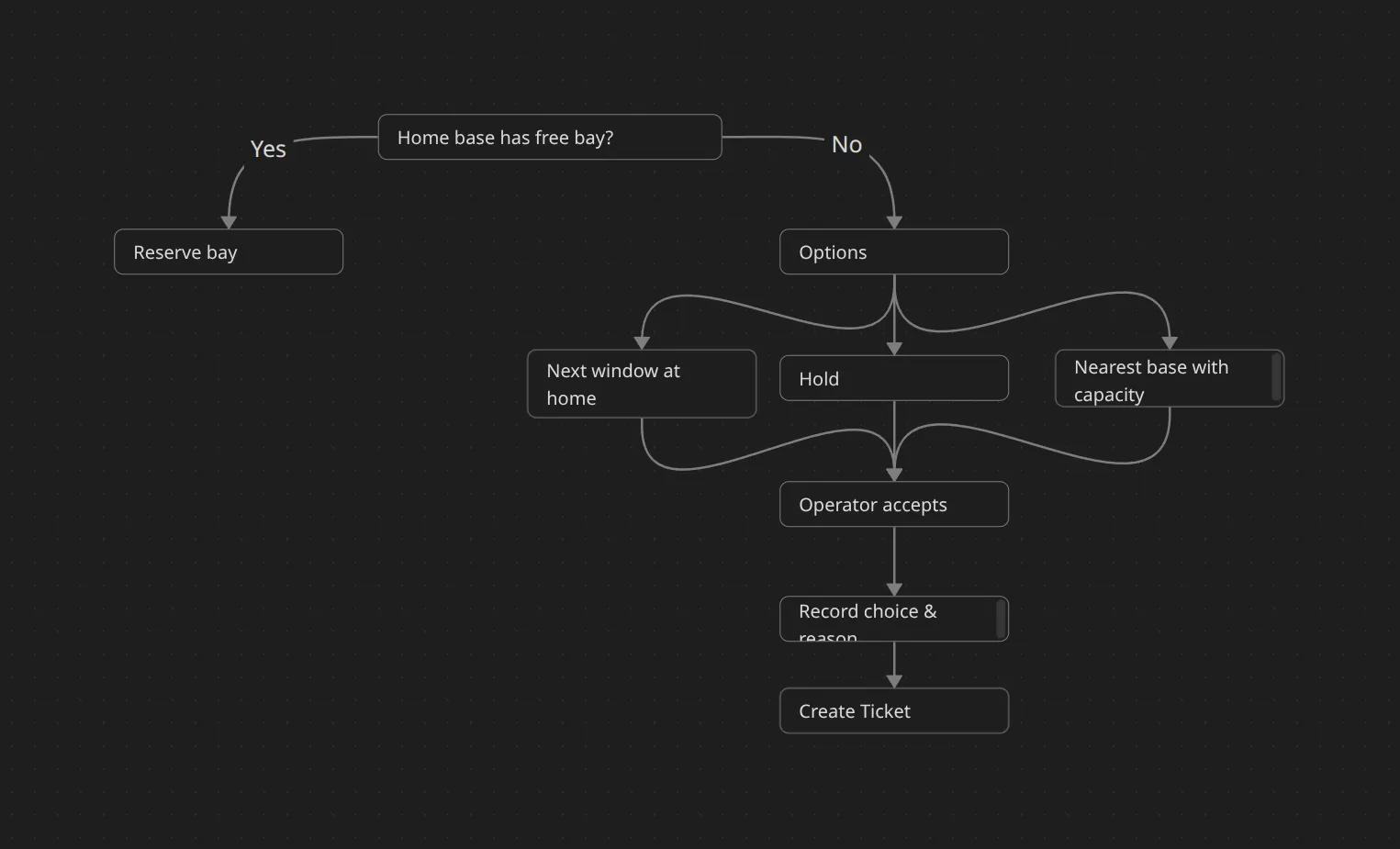
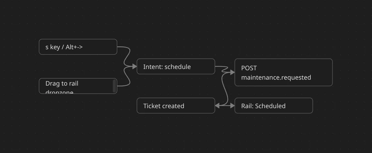
The Bases + Maintenance board keeps deck capacity kanban board(70% of screen real estate) and ticket lifecycle (30% rail) side-by-side. Dragging or key-routing a craft to the rail locks a bay, attaches a telemetry snapshot, and shows capacity impact immediately. Undo persists for 10 seconds regardless of input source so supervisors can reverse accidental moves. The goal was to create high-density view of bases and quick access to automatic maintenance ticket creation.
Due to the nature of the backend systems and overall drone management, we decided to base kanban not on statuses, but on bases drones are attached to. It allowed for better visibility and spatial mapping of drones to their respective bases, and in turn better maintenance. Right rail for maintenance is subdividing drones by statuses and tracks the progress of the maintenance. We use DnD kit library to implement simple drag and drop of drones to “Maintenance” zone for quick ticket creation. Crew thinks to also use this approach for reattaching drones from one base to the different one, but they need to create and wire proper API infrastructure to handle such requests. CSV export allows for telemetry history export of selected drones to track what went wrong and where. We plan to implement visual system with playback for seeing drone telemetry in app without the need to export CSV.
Step 3 — Keyboard Navigation & Unified Input
Two of the main features we discovered were needed to improve navigation were:
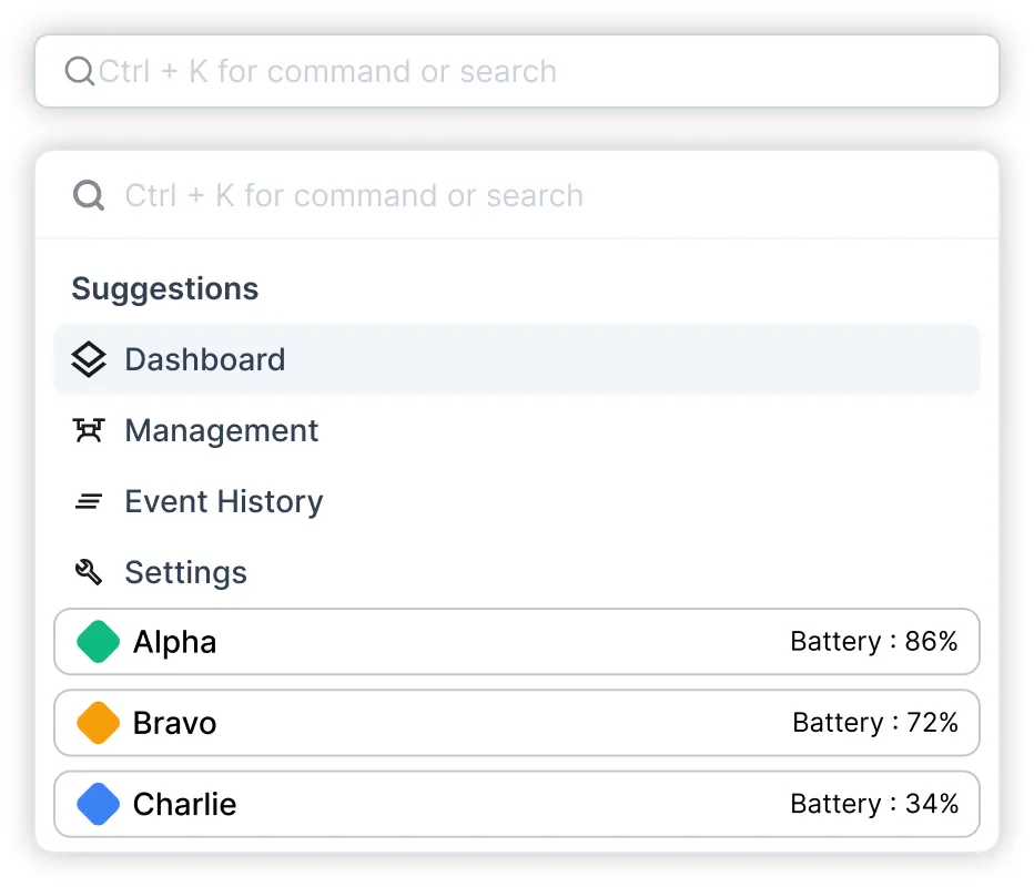
- Command pallette - a unified control panel for quick lookup of entities, statuses, and so on. It allows for quick navigation by the name, status, mission id, and so on.
- Keyboard navigation system: a lot of supervisors we talked to were very accustomed with efficient keyboard navigation systems and wanted a way to translate their muscle memory to such dashboard for quicker navigation. Mouse navigation is limited by physical throughput (muscle memory plays less of a role here and user has to look for an option to click, which is generally slower than memorizing commands/keybinds and typing them out)
Shortcut map
Global
Cmd/Ctrl+K   Command palette (search entities/bases; run actions)

?            Shortcut overlay (context‑aware)

/            Filter in current list or view

u / Ctrl+Z   Undo last state change (10 s)

Esc          Close drawer/popover; cancel pending action
View A — Overview Map (Entities + Detail Drawer)
Focus rails

Ctrl+1       Focus Entities list

Ctrl+2       Focus Map

Ctrl+3       Focus Details drawer


Entities list

↑/↓          Move

Enter        Select → open Details drawer


Map

←/→/↑/↓      Pan map

+ / -        Zoom

L            Cycle layers (Entity → Status → No‑fly zones → D‑Point)

Enter        Open Details drawer for focused pin


Details drawer

Tab          Step through sections (Mission, Battery, Link, GPS, Position)

m            Open Maintenance scheduling drawer (pre‑filled)

Ctrl+Enter   Confirm action in drawer
View B — Bases + Maintenance Rail (70⁄30)
Pane focus
[ Focus Bases pane
] Focus Maintenance rail
Bases pane (per base: Ready / On Mission / Charging)
j / k Move within the current stack
h / l Move across base columns
1 / 2 / 3 Jump to Ready / On Mission / Charging within current base
Home / End Jump to top / bottom of stack
Space Select or toggle card
a Select all in stack
Enter Open details drawer
s Schedule maintenance (drawer → Ctrl+Enter confirms)
Alt+→ Quick‑route to rail Scheduled (default reason from latest alert)
x Toggle Stats on focused card
Shift+X Toggle Stats on all selected cards
Ctrl+X Collapse all Stats in pane
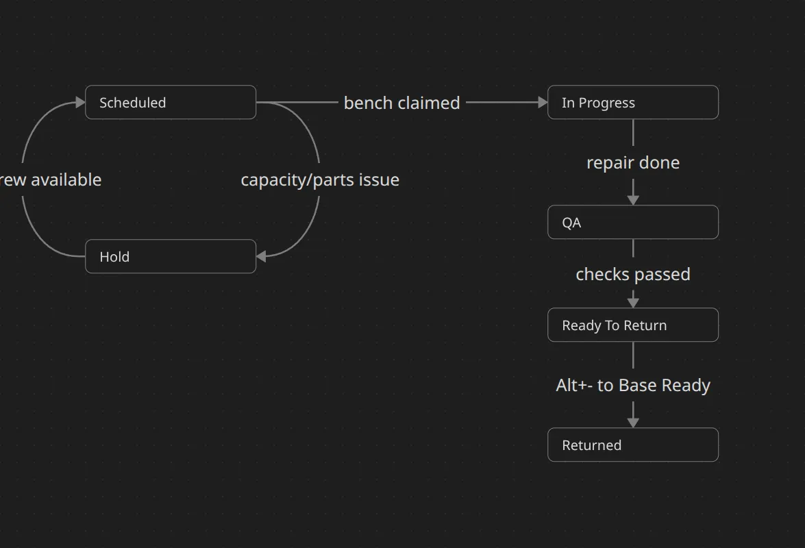
Maintenance rail (Scheduled → In Progress → QA → Ready to Return → Hold)
j / k Move within the active list
Tab/Shift+Tab Cycle lists
i Mark In Progress
q Move to QA
r Mark Ready to Return
H Hold / clear Hold
t Open ticket drawer
Alt+← Return to base Ready (closes ticket)
Enter Primary action in drawer; Ctrl+Enter confirms
Rail filters
f My bays only (crew‑scoped)
/ Filter (e.g., reason:battery, base:Victoria, priority>=2)
Tests, Methodology & Cognitive Load
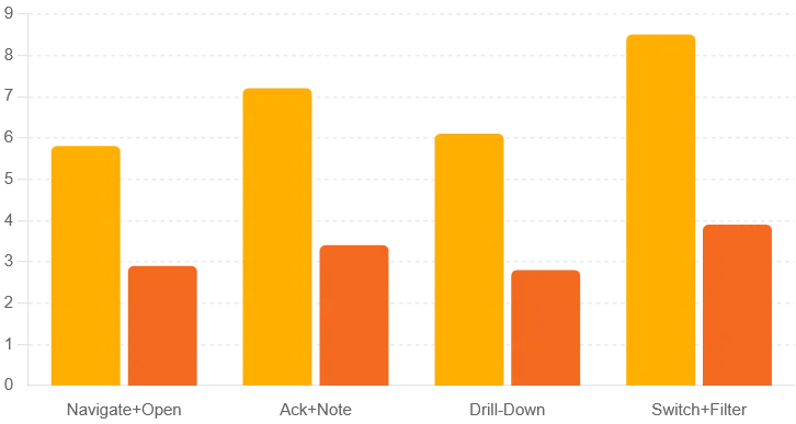
We ran a within-subjects evaluation inside a safe Hong Kong geofence: two bases, one mothership, sixteen UAVs, 2–4 mixed-severity alerts, live telemetry (heartbeat, battery, link degradation, geofence warnings). Participants completed four golden-path tasks (navigate + open, acknowledge + note, drill-down, switch + filter) twice—first mouse-only, then keyboard-enabled—on 27″ workstations. We captured timings, alert lifecycle logs, and playback markers for post-analysis.
Observed deltas
-
Navigate + open: 5.8 s → 2.9 s (−50%).
-
Acknowledge + note: 7.2 s → 3.4 s (−53%).
-
Drill-down: 6.1 s → 2.8 s (−54%).‘t
-
Switch + filter: 8.5 s → 3.9 s (−54%).
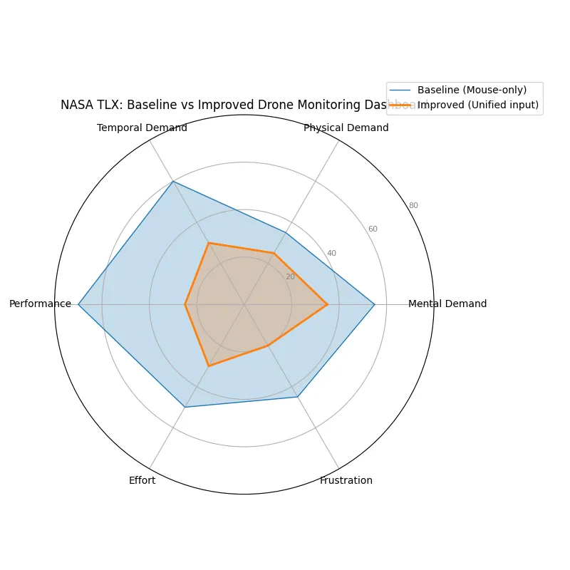
NASA TLX confirmed the behavioural gains: workload ≈53 → 28, mental demand −36%, temporal demand −50%, frustration −55%. Operators described the UI “quick to use” and “intuitive”. During a 30‑minute streaming soak we observed zero focus theft and maintained ≥15 FPS playback.
Validity & limitations
-
Construct validity held: tasks mirrored real supervisory work.
-
External validity remains a risk: we didn’t have capacity to test it with higher amount of drones
-
Counterbalancing and warm-up laps reduced learning bias; raw logs (TTI, TTA, lifecycle) remain for partner audits.
-
Accessibility checks during the study confirmed full keyboard traversal, WCAG AA tokens, and no focus theft during 30-minute streams.
Business Angle & Validation
We are commercializing a hybrid delivery capability, not just a dashboard. We use industry-standard communication protocols (MAVLink) for drone communication and telemetry, so potential commercial users and partners can easily connect their API’s to our dashboard for tracking.
We use default for this sphere QR-code based landing validation, so already existing delivery drones can be easily integrated into the net.
The only potential proprietary part of it is HKUST maritime drones. They use their own mesh network system for drone connection, as well as specially made floating drifter which is placed outside of the mothership and follows it for drift compensation when mothership is static. it measures its velocity, compares it to measured velocity of the craft and calculate the drift. This allows mothership to reliably stay in the same place, as due to multipathing and not always reliable GPS signal it can drift and in return, it can lead to UAV’s losing the position of mothership.
HKUST R&D also builds its own proprietary drones and embedded software for them, specifically to handle such delivery workloads.
NDA conversations with Hong Kong and mainland Chinese delivery majors validated immediate demand; global logistics players see the same pattern drone delivery logistics.
Success metrics for pilots focus on time-to-trial, coverage delta once mothership legs activate, supervisory MTTR in real ops, and keeping UI-induced geofence violations at zero.
Why it lands with partners:
-
Integration-first: adapter-friendly normalization layer plus versioned contracts keep ingest predictable even with vendor quirks.
-
Operational trust: read-only supervision, role-scoped visibility, immutable playback, and CSV exports make compliance teams comfortable.
-
Market unlock: maritime handoffs convert “no-go” water gaps into short, rule-compliant hops, expanding the serviceable address base without rewriting regulation.
-
GTM shape: Phase 1 technical validation (feed ingest, supervised demos) → Phase 2 limited trials on water-locked routes → Phase 3 scaled adapters + supervisor training.
Results, Lessons Learned & Next Steps
-
Adoption & speed: Mouse-only supervisors retained ≥95% completion; keyboard users cut repeatable steps by ~50%.
-
Signal quality: Correlated alert families and cooldowns reduced duplicates ≈40%; Ack → Own → Resolve adherence exceeded 85%; first-glance custody recognition cleared 90%.
-
Reliability: Playback held ≥15 FPS at 500 UAVs + 10 motherships; WCAG AA tokens and focus stability survived 30‑minute soaks.
-
Commercial traction: Demo builds (overlays, alert centre, playback, CSV exports) continue to secure partner pilots under NDA.
Lessons learned: keyboard is a feature, not a separate mode; telemetry architecture is UX; alert taxonomy beats raw volume; maintaining the “no piloting” boundary keeps trust intact.
What shipped vs prototype: demo-ready Overview map, alert centre, command palette, playback/export, accessibility pass; prototype features (incident compare analytics, what-if capacity checks, predictive ETAs, shortcut telemetry dashboards) sit behind flags.
Known limitations: alert correlation thresholds still need broader tuning; partner-specific adapters remain on the roadmap.
Next steps: expand trials to capture real MTTR and coverage deltas, instrument shortcut telemetry for pruning, codify adapter patterns for partner fleets, and layer marine weather overlays (wind vectors, swell, precipitation) that trigger micro-alerts when launch windows shift.